You have just 0.05 seconds to grab someone’s attention on social media* before they scroll past, making design your most powerful tool to stand out.
That’s why I created the “Made You Look” banner/cover/masthead, a bold and eye-catching header perfect for all my social media platforms. The design uses primary colors—blue, red, yellow, and a touch of green—alongside a stark black-and-white contrast to ensure it stands out in a crowded digital space.
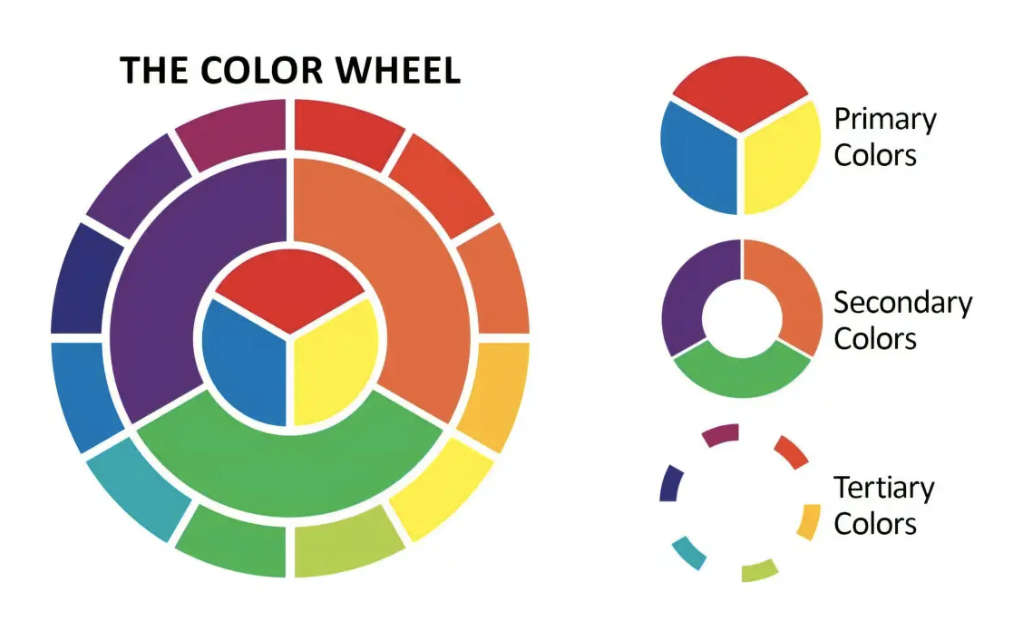
Why Primary Colors?
Primary colors are the building blocks of the color spectrum, universally recognized and emotionally evocative. Blue conveys trust and reliability, red demands urgency and passion, yellow radiates optimism, and green adds a sense of balance and the urge to GO! Together, they create a visual harmony that’s impossible to ignore.
In the “Made You Look” banner, these colors are arranged in a geometric layout inspired by modernist art**, giving the design a timeless yet contemporary feel. The black outlines and text provide a sharp contrast, ensuring the words pop against the vibrant background, while the gray section adds a subtle balance to avoid overwhelming the viewer.
The Importance of Grabbing Attention First
On social media, users scroll through endless content at lightning speed. If your header doesn’t stop them in their tracks, your message—no matter how insightful—will go unnoticed.
The “Made You Look” banner is designed to do exactly that: halt the scroll.
See More [R. Michael Brown, Marketing Consultant]
Don’t be boring! Don’t look like everyone else! Click the link above to learn more.
